MUI
Table of Contents
Open Table of Contents
Customization
Overriding nested component styles
You can use the browser dev tools to identify the slot for the component you want to override. It can save you a lot of time. The styles injected into the DOM by MUI rely on class names that follow a simple pattern: [hash]-Mui[Component name]-[name of the slot].
⚠️ These class names can’t be used as CSS selectors because they are unstable, however, MUI applies global class names using a consistent convention: Mui[Component name]-[name of the slot].
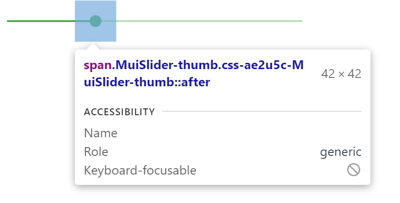
In this example, the styles are applied with .css-ae2u5c-MuiSlider-thumb so the name of the component is Slider and the name of the slot is thumb.
You now know that you need to target the .MuiSlider-thumb class name for overriding the look of the thumb:
    <Slider
      defaultValue={30}
      sx={{
        width: 300,
        color: 'success.main',
        '& .MuiSlider-thumb': {
          borderRadius: '1px',
        },
      }}
    />
Overriding styles with class names
If you would like to override the styles of the components using classes, you can use the className prop available on each component. For overriding the styles of the different parts inside the component, you can use the global classes available for each slot, as described in the previous section.
You can find examples of this using different styles libraries in the Styles library interoperability guide. State classes
The components special states, like hover, focus, disabled and selected, are styled with a higher CSS specificity. Specificity is a weight that is applied to a given CSS declaration.
In order to override the components’ special states, you need to increase specificity. Here is an example with the disable state and the Button component using a pseudo-class (:disabled):
.Button {
  color: black;
}

/* Increase the specificity */
.Button:disabled {
  color: white;
}.Button {
color: black;
}
/* Increase the specificity */
.Button:disabled {
color: white;
}<Button disabled className="Button">Sometimes, you can’t use a CSS pseudo-class, as the state doesn’t exist in the web specification. Let’s take the MenuItem component and its selected state as an example. In such cases you can use a MUI equivalent of CSS pseudo-classes - state classes. Target the .Mui-selected global class name to customize the special state of the MenuItem component:
.MenuItem {
  color: black;
}

/* Increase the specificity */
.MenuItem.Mui-selected {
  color: blue;
}<MenuItem selected className="MenuItem">Customize components
TextField
    <TextField
      id="standard-basic"
      label="Standard"
      variant="outlined"
      sx={{
        width: "100px",
        "& .MuiInputBase-root": { height: "30px" },
        "& .MuiFormLabel-root": { top: "-11px" },
      }}
    />
Collapse
import * as React from "react";
import ListSubheader from "@mui/material/ListSubheader";
import List from "@mui/material/List";
import ListItemButton from "@mui/material/ListItemButton";
import ListItemIcon from "@mui/material/ListItemIcon";
import ListItemText from "@mui/material/ListItemText";
import Collapse from "@mui/material/Collapse";
import DraftsIcon from "@mui/icons-material/Drafts";
import ExpandLess from "@mui/icons-material/ExpandLess";
import ExpandMore from "@mui/icons-material/ExpandMore";

import PersonIcon from "@mui/icons-material/Person";
import EditIcon from "@mui/icons-material/Edit";
import FaceRetouchingNaturalIcon from
	"@mui/icons-material/FaceRetouchingNatural";
import ArticleIcon from "@mui/icons-material/Article";
import LogoutIcon from "@mui/icons-material/Logout";

export default function NestedList() {
	const [open, setOpen] = React.useState(true);

	const handleClick = () => {
		setOpen(!open);
	};

	return (
		<>
			<h1 style={{ color: "green" }}>
				GeeksForGeeks</h1>

			<List
				sx={{
					width: "100%", maxWidth: 360,
					bgcolor: "background.paper"
				}}
				component="nav"
				aria-labelledby="nested-list-subheader"
				subheader={
					<ListSubheader component="div"
						id="nested-list-subheader">
						Setting
					</ListSubheader>
				}
			>
				<ListItemButton>
					<ListItemIcon>
						<PersonIcon />
					</ListItemIcon>
					<ListItemText primary="My Profile" />
				</ListItemButton>
				<ListItemButton>
					<ListItemIcon>
						<DraftsIcon />
					</ListItemIcon>
					<ListItemText primary="My Courses" />
				</ListItemButton>
				<ListItemButton onClick={handleClick}>
					<ListItemIcon>
						<EditIcon />
					</ListItemIcon>
					<ListItemText primary="Edit" />
					{open ? <ExpandLess /> : <ExpandMore />}
				</ListItemButton>
				<Collapse in={open} timeout="auto" unmountOnExit>
					<List component="div" disablePadding>
						<ListItemButton sx={{ pl: 4 }}>
							<ListItemIcon>
								<FaceRetouchingNaturalIcon />
							</ListItemIcon>
							<ListItemText primary="Edit Profile" />
						</ListItemButton>

						<ListItemButton sx={{ pl: 4 }}>
							<ListItemIcon>
								<ArticleIcon />
							</ListItemIcon>
							<ListItemText primary="Edit Articles" />
						</ListItemButton>
					</List>
				</Collapse>

				<ListItemButton>
					<ListItemIcon>
						<LogoutIcon />
					</ListItemIcon>
					<ListItemText primary="Logout" />
				</ListItemButton>
			</List>
		</>
	);
}
Autocomplete
import * as React from "react";
import TextField from "@mui/material/TextField";
import Autocomplete from "@mui/material/Autocomplete";
interface Ifilm {
  label: string;
  year: number;
}
export default function ComboBox() {
  const [value, setValue] = React.useState<Ifilm | null>();
  const [inputValue, setInputValue] = React.useState("");
  return (
    <Autocomplete
      value={value}
      onChange={(event: any, newValue: Ifilm | null) => {
        setValue(newValue);
      }}
      inputValue={inputValue}
      onInputChange={(event, newInputValue) => {
        setInputValue(newInputValue);
      }}
      disablePortal
      id="combo-box-demo"
      options={top100Films}
      sx={{
        width: 300,
        "& .MuiInputBase-root": { height: 100 },
        "& .MuiFormLabel-root[data-shrink='false']": {
          transform: "translate(14px,37px)"
        }
      }}
      renderInput={(params) => <TextField {...params} label="Movie" />}
    />
  );
}

// Top 100 films as rated by IMDb users. http://www.imdb.com/chart/top
const top100Films = [
  { label: "The Shawshank Redemption", year: 1994 },
  { label: "The Godfather", year: 1972 },
  { label: "The Godfather: Part II", year: 1974 }
];